If you are planning on creating a new Squarespace blog or are stuck in a design rut, here are some examples you can use as a source of inspiration.
In addition, with Squarespace, you can create beautiful websites and efficiently run your blog. Furthermore, to give you a headstart on creating your website, here’s our list of Squarespace website examples that will inspire you to develop aesthetically-pleasing designs for your audience.
Why Use Squarespace?
Squarespace is more than just a website builder. It offers design tools that make your website creative and innovative as box printing makes your packaging different and novel. These tools help your blog or business stand out from any other competitors.
Apart from SEO, design is one of the most important parts of a Squarespace website.
Squarespace's design capabilities are endless. Additionally, you get access to powerful site-building tools that elevate your business and generate traffic. Definitely, every Squarespace site is unique, so you don't have to worry about copying anyone else's design.
Now that you understand this platform's creative capabilities, let's look at some Squarespace website examples that will help you with your Squarespace blog.
Bathhouse
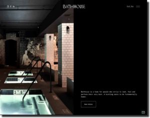
Source: Bathhouse
The Bathhouse is a high-end spa, retreat, and dining experience in Virginia.
The business offers several amenities such as saunas, thermal pools, steam rooms, etc. In addition, the Bathhouse has been featured in several prominent publications such as Vogue.
Moreover, this is one of the most innovative Squarespace website examples for a wellness-related website. As you can see on this website, the color palette and site draw on minimalism. It uses a simple font that is easy to read. If you're looking for the perfect fonts, you can find dozens of examples in our complete guide to Squarespace font pairings.
The website also features a lot of pictures of their location. Images give the audience an idea of what the space is like and the atmosphere. In addition, the use of black and white helps the photos stand out even more.
You can access links to Bathhouse’s social platforms. You also get a book now button. This makes it easier for customers to make purchases. A design such as this will elevate your wellness business.
The website features sections that are relevant and necessary for a wellness site. Also, there is also a personalization option available on the website. In addition, this personalization button enhances the user interface, which leads to a positive user experience.
Jones Bar-B-Q
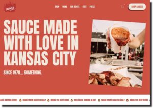
Source: Jones Bar-B-Q
The cuisine of Kansas City inspires the Jones Bar-B-Q website. The restaurant has a long history and started back in 1970. The business is located in Kansas City, and they are famous for its delicious flavors.
Apart from its restaurant, the Jones Bar-B-Q business also produces sauces that can be purchased globally. If you are looking for restaurant-related Squarespace website examples, this is your website.
The website features a bright color scheme filled with shades of red and beige.
The font is bold and makes each word stand out. This design scheme fits perfectly with the store’s fire logo and relates to their food.
If you want to create a website for a business similar to Jones Bar-B-Q, you should start with a bold and eye-catching template. This will attract audiences to your site and make them more likely to purchase your product.
Visuals are one-half of a great food product, and this website features plenty of images. These images are high-quality and inviting.
The restaurant has a lot of history, and this is something we can see on its website. You see pictures of the owners and their stories as you scroll down. If you have a business that has an interesting backstory, you can use this format.
Supernatural
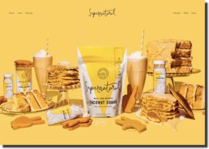
Source: Supernatural
Supernatural is one of the most visually-stunning Squarespace website examples. This brand is built on creativity in the kitchen, and its design speaks for them. Supernatural is a new plant-based brand in the baking industry.
Their packaging is bright and colorful with a whimsical font. This brand identity is seen throughout their website. The website uses the color yellow throughout to look similar to their product design.
The featured image on Supernatural’s Squarespace blog is a high-resolution picture of all their products and how to use them. The concept is eye-catching and gives the audience an idea of how to use their products.
If you want to design a baking product e-commerce store, you can follow the pattern set by Supernatural. The website features a plugin that shows their Instagram feed. As audiences scroll down through the website, they can look at social media as colorful and bright as their site.
How Supernatural integrate its social media and website is a great example of how you can market your site. Similar themes make integration seamless. If you want to put your Instagram on your website, make sure that both platforms match their aesthetic.
The website also features sections dedicated to recipes, reviews, and their shopping catalog. These sections will inspire you to create your next baking goods website with Squarespace.
Oishii
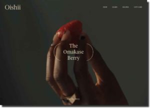
Source: Oishii
Oishii is a Japan-based company selling Omakase berries. The company’s motto is quality over quantity, and you can see this message through its website design. Even though the company is Japan-based, they mainly sell its products in the US locations of New York, New Jersey, and Los Angeles.
Oishii is one of the best Squarespace website examples for a global e-commerce site. One of the biggest advantages of creating an e-commerce website is the ability to reach a global audience. Squarespace allows features that make it easier for sellers to do business globally.
As mentioned before, Oishii’s brand identity is a high-quality product rather than a wholesale product. Their site features a minimalist design that echoes this sentiment. The site design is simple rather than busy, and the font is very easy to read.
The website uses a color scheme that is similar to its product. You see the use of shades of reds and berry tones throughout the website. This color scheme helps the audience stay connected with the product.
If you are marketing a product like Oishii, you can also employ banners to advertise a new product. A the top of the website, you see a banner telling customers when new products are ready and available to be purchased. This type of advert lets the customers know that your product is fresh.
Studio McGee
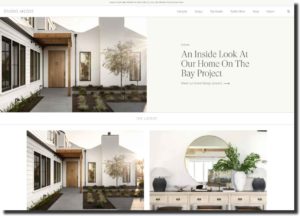
Source: Studio McGee
There are several instances where the audience can see a family-run business. Studio McGee is an interior design firm, and their website acts as a portfolio of their work. A husband and wife team runs the company, part of its brand identity.
Studio McGee's website design is minimal, yet it features a lot of its content. The featured image is a slideshow of their various design projects throughout the company's run.
Once you scroll down, you can look at several more projects organized in a neat grid-like pattern. This pattern is a great way to display your design or photography portfolio.
You can also see sections for lifestyle, design, their Netflix show, and their shop on the website. Their lifestyle sections as a personal blog for the couple, while the design sections are all about their work. This work/life balance is one of the key features of a brand like Studio McGee.
If you are running a family-owned business, you can also add personal elements alongside your work to show your brand identity and your product. Studio McGee takes this one step further by not only offering their products and products from other brands they enjoy. This gives their website a personal and professional touch.
Personal Effects
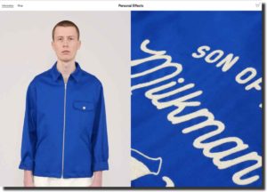
Source: Personal Effects
Personal Effects is a menswear line based in London. The clothing company features items from everyday basic wear to outwear for men. All items are handmade with the best quality materials and keen attention to detail.
Personal Effects brand provides essential design-forward clothing for men. This is one of the most minimalist Squarespace website examples for clothing brands. They emphasize that less is more and only want to produce a refined product.
The brand’s message is seen throughout the website due to its design. The website is very minimal and only focused on clothing. The fonts and the colors make the website look clean, and your focus is always on the clothes.
The most eye-catching feature of the website is its picture, and even those pictures are shot in a manner that only highlights the clothes.
The featured image is a large high-quality picture of their products, and as you scroll down, you see their catalog.
The website only features two sections with a dropdown menu adding to its minimalist aesthetic. If you want to create a minimalist website, this site can be a great source of inspiration for you.
Steve Benjamins
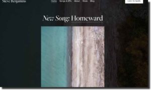
Source: Steve Benjamins
Steve Benjamin is a singer-songwriter based in Toronto, and his website acts as a portfolio for his talent. You can listen to his music on the website, check out his blog, and learn about any live performances he might be hosting. You also have the option of purchasing his music.
If you are a musician, a performer, or in any other creative field, you can create a site inspired by Steve Benjamin to showcase your talent. Steve Benjamin's homepage shows his latest music and blog post. This is a great way to advertise your new product to the consumers.
Squarespace allows you to put your latest product on your homepage or featured image to attract new consumers. Benjamin's site design is simple, and your only focus is on his music and blog.
If you create a Squarespace blog too busy, you risk losing your audience. Benjamin's site uses the Squarespace lightbox plugin to create a focused design. This plugin puts the background in a shadow and makes his music cover stand out.
Squarespace's lightbox plugin is an innovative way to make your product stand out from the rest of the video. This process helps the audience stay focused on your product or service.
KeyNest
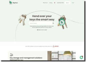
Source: KeyNest
KeyNest is a software program that digitally tracks the movement of your keys. Real estate agents, Airbnb renters, and serviced apartment owners recommend this service. KeyNest is an in-demand service that over 1 million people have used.
KeyNest is a great Squarespace website example for software companies. Their site design showcases how you can market your product to a vast audience.
The website sections are informative, and you can click on them to find out the pricing plan and who can use the product. Having this information at the top of the page makes it easier for consumers to navigate the website.
For any service, customer support is important, and your website should always include this feature. The website features a live chatbot plugin that makes it easy to provide quick and efficient customer service. This is an important plugin If you want to create an e-commerce site selling a service.
The landing page offers a search bar that quickly lets customers know if KeyNest is available in their area. This geographical feature can help you access your target audience and gain sales.
As consumers keep scrolling down, they learn the benefits of the products, and they can also look at reviews before purchasing the service. This layout is beneficial if you offer a service as it shows transparency and builds trust with your audience.
Blue Dog
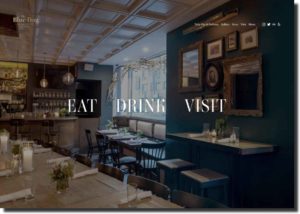
Source: Blue Dog
Blue Dog is an upscale modern restaurant located in Chelsea, NYC. The website design mimics the restaurant's current theme. Blue Dog offers healthy options to its customer and emphasizes that they only use fresh ingredients.
On the website landing page, you only get a controlled view, and you don't get the option to keep scrolling. Definitely, this keeps your focus on the landing page, which uses a lightbox plugin.
In the shadows, you can see the restaurant's picture, which is a great way to let the customer know about the atmosphere and setting of the place. The landing page features three clickable links titled eat, drink, and visit. Once you hover over the link, you get a corresponding picture.
These three links keep your focus on the menu and easily give you directions to the restaurant. The website design is simple yet bold, tying into the restaurant's modern theme.
If you want to create a website for a modern restaurant, you can get inspiration from this design choice. Having a simple and pared-down design will make it easy for customers to focus on your restaurant's food and atmosphere.
The Sorry Girls
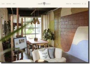
Source: The Sorry Girls
The Sorry Girls is a creative studio founded by two college friends. The Sorry Girls company creates interior design products, podcasts, videos, and homemade crafts. Their eclectic and fun design aesthetic is featured throughout their website.
The website design is similar to the office space featured on their landing space. If you run a creative studio or company, you can also incorporate your office’s design aesthetic into your company’s website.
Design is at the core of The Sorry Girl’s company motto, and you can see it in various parts of their website. You see various color schemes on the about us page and the meet the team page. The color scheme helps market their brand and attract their desired audience.
The company also emphasizes the need for community building, and you can see this through their marketing. The website features a blog section and a section for social media. You can access their YouTube channel from their website. The links are in a dropdown menu, so the website doesn’t seem busy.
If you want to add your social media to your website, you can create a separate section with a dropdown menu for an organized look.
Architecture In Formation
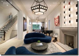
Source: Architecture In Formation
Architecture In Formation is a New York-based architecture firm that works on high-end apartments, houses, and multi-family units. The company is known for using innovative technology in its architectural designs.
This is one of the best architectural Squarespace website examples. The website is design-forward to emphasize the nature of the company. Your architectural website can follow this website for design inspiration.
The static landing page features pictures from projects, and no text is laid upon the photographs. This means that all your attention stays on their design. The simple web design also keeps your focus on images.
Keeping your design projects at the center is important if you create an architectural design website. The website features only four sections with dropdown menus to keep the site simplified. They have also added social media buttons for even more visual aids.
Minna
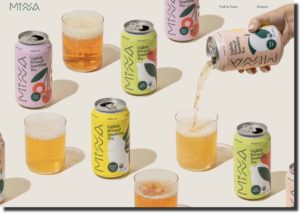
Source: Minna
Minna is an organic tea company with a quirky and colorful design. Mina produces tea free of excess sugar and has a light taste. The company offers several different flavors available in individual cans or variety packs.
Minna’s brand identity is closely tied to its website design. The website is simple yet fun and colorful. The landing page features an image of all their flavors, and the use of a simple white background makes their design stand out.
If your packaging design is colorful, you can also similarly compose your photos to make your products attractive to customers.
You can look at all their flavors as you scroll down the page. Each flavor has a background that matches the can’s packaging. This design feature makes the product aesthetically pleasing and attractive.
The colors are bright but subdued, so they don’t seem busy to consumers. You can play with pastel tones to create an eye-catching and simple design to create a colorful website.
Automata
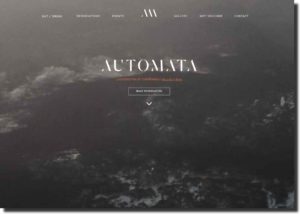
Source: Automata
Automata is a fine dining Australian restaurant that features various fine dining options. Customers can choose from a five or 7-course meal, and they can also customize their plan to create a unique experience.
If you are looking for Squarespace website examples for fine dining restaurants, then Automata is the website for you. Automata feature a classy and luxurious design that fits the tone of their restaurant.
The muted colors are present in fine dining restaurants, and Automata employs a similar color scheme on their website. You see a gallery of pictures highlighting their food as you scroll down. The dinnerware and background in the shots are also gray, just like their website.
Automata’s landing page shows all the necessary information a customer might need. They mention their address and provide a button to make a reservation. Adding such information to your website will make it easy for customers to interact with your site.
Edible Boston
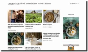
Source: Edible Boston
Edible Boston is a food-centric publication based in Boston and its surrounding areas. The website mimics a magazine with all its articles on the landing page. Edible Boston also has a blog that features recipes, and you can find recommendations for local eateries.
The website’s landing page has a grid-like layout of all its articles. Each article features an image and title. This design keeps the page clean despite all the content. If you run a publication company, you can use a similar pattern for your website.
On the website’s sidebar, you can see the latest issue of their magazine. Consumers can click on this image to access all the content from that particular issue.
Sanara

Source: Sanara
Sanara is a luxury resort located in Tulum, Mexico. The resort offers services for relaxation. Sanara's brand identity revolves around physical and spiritual healing. The website design fits the tone of Sanara's identity.
Sanara is one of the most beautiful websites on this list. The site features a light and airy design that fits the resort's tone. Users who access this website will feel calm while navigating it.
The landing page features the text "welcome home," a great way to feel welcomed and create potential customers. The site is designed to build trust with the audience, a key feature of any hospitality site.
Final Takeaway
The list features some of the most creative Squarespace website examples. Look through this list and find inspiration for your next e-commerce website.
Tags: squarespace, squarespace website